Got a smartphone? Don’t you just hate it when you visit a website, only to be served with a “mobile optimised” version of that site.
Now, we know those sites are in place for our benefit… they load faster, and typically exclude Flash, ads, and other junk that slows down the mobile experience… but now and again, we need to get to the other stuff on the site, and sometimes it’s hard.
Today, the problem with mobile versions of a website caused me a real problem. I used my iPhone to visit the Maplin website at www.maplin.co.uk – The browser redirected me to mobile.maplin.co.uk – which was down. Here’s a screen capture of what the Maplin site has been doing all day today:

The problem was only with the mobile website – the desktop version was fine, but there was no way to get the iPhone to do to the Desktop version. We found a way though – it look a couple of minutes, and this was what we were able to get on our iPhone 4:

So, how did we manage to get our iPhone to start showing the desktop version of websites? Well, sadly there’s no magic setting on the iPhone to do this? Well…
How to make an iPhone avoid a Mobile website
To be able to fool a website into not giving us the optimised version, what we ended up doing was to install a different web browser. A browser that can “pretend” it’s not a mobile phone browser.
After some research, we found the Atomic Web Browser for iPhone – the free version doesn’t do the magic we needed, but the 69 pence browser app does.
If you’re sick of mobile versions of websites, pay your £0.69 and download the app in iTunes (link), then do the following:
- Open the Atomic Web app
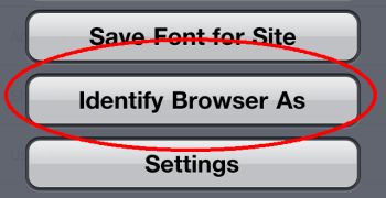
- Press the Settings button (looks like a cog)
- Select “Identify Browser As”

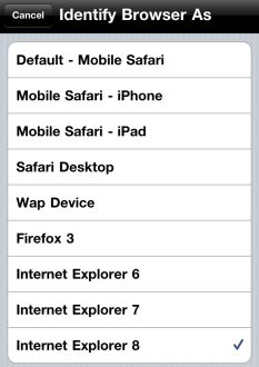
From the next screen, you have the option to change what’s known as the “UA Prof” (or User Agent Profile String). This is the setting in a web browser that identifies the browser to websites. The iPhone browser says “Hello, I’m an iPhone”. The setting in the Atomic Web browser allows you to get the browser to pretend to be something it’s not. Here’s what it can identify as:

So there you go. We set our browser to be an Internet Explorer browser, and the Maplin site was happy to believe we weren’t an iPhone and let us in.
The solution worked for us. We hope it’ll work for you too!


Hi you raise a good point here, I design mobile websites and it really annoys me when I find mobile optimized sites that don’t give the user the option to view the full desktop site, All that is required is a simple link back to the full site with a small bit of code telling the browser not to revert back o the mobile website again. As you have just proved form your post here it gives mobile sites a bad name, though to be blunt shear lack of consideration for the website visitor. As you said mobile websites give a great option for smartphone user’s but it should be just that an option.